Audit, and visual design overhaul to products that save lives

Versaterm has a large amount of digital products to help with public safety. Since their products have been around for a while, they have been adding on features without looking at everything as a whole. With many visual and user flow problems, we dive in to update their systems to help serve their customers better.

Client
Versaterm
Timeframe
2 Months
Service
Digital Product Overhaul
Tools Used
  • Figma
  • Miro
  • Photoshop

Project Overview

Versaterm Public Safety is a global public safety solutions company helping agencies transform their organizations. Versaterm has an ecosystem that enhances community safety by creating purposeful integrations across the public safety spectrum.​ Our strategy is focused on improving customer and user workflows for more efficient and effective operations that lead to better service and more just outcomes.​ Versaterm came to us with two programs that have been around for years. Features have been added year after year. The products did not have consistent workflows or visuals. It was time for a much needed audit and face lift. The two applications we were focusing on were vCAD (Computer Aided Dispatch) for Dispatchers and MDT (Mobile Data Terminal) for First Responders. As the lead designer on this project I managed the design team and delegated sections of the project.

Versaterm vCAD Application - Current State
Versaterm MDT Application - Current State

Challenges

Getting existing user to use an updated flow and visual updates is always a challenge. Using logic and facts drove our design decisions and helped user feel comfortable changing the look of their existing apps. Users are put in extremely stressful situations and are not allowed mistakes since lives are at stake.

Police officers use the MDT interface on a computer in their cop car while in pursuit. The interface is second nature and buttons need to be in relatively the same spots along with large enough touch points for quick access to reports situations.

Dispatchers use vCAD for capturing information. These users need flexibility as they’ve had the ability to change colors and placement of product windows in different locations depending on the companies preferences. Making updates to this application while adhering to design common practices was a obstacle. We also needed to think about how notifications and tool tips were displayed since their were many different and conflicting styles.

Goals:
MDT: ADA compliant, light and dark mode, button/ visual uniformity, and visual and component guidelines
vCAD: Microsoft interface components, pairing down colors to be ADA compliant while also being flexible to match companies brand colors, visual and component guidelines, and keyboard friendly shortcuts
Requirements
  1. High-level review of Versaterm CAD and MDT audit findings
  2. Redesign of key screens from vCAD and MDT interfaces
  3. Clickable prototype demonstrating workflows and interactions of redesigned vCAD and MDT
  4. Guidance and support for presenting prototype to stakeholders and users for feedback
  5. Revisions to design and prototype, as per feedback provided by stakeholders and users
  6. Early stage design guidelines detailing usage of brand elements
  7. Early stage Figma-based design system containing specs for initial UI components

Process

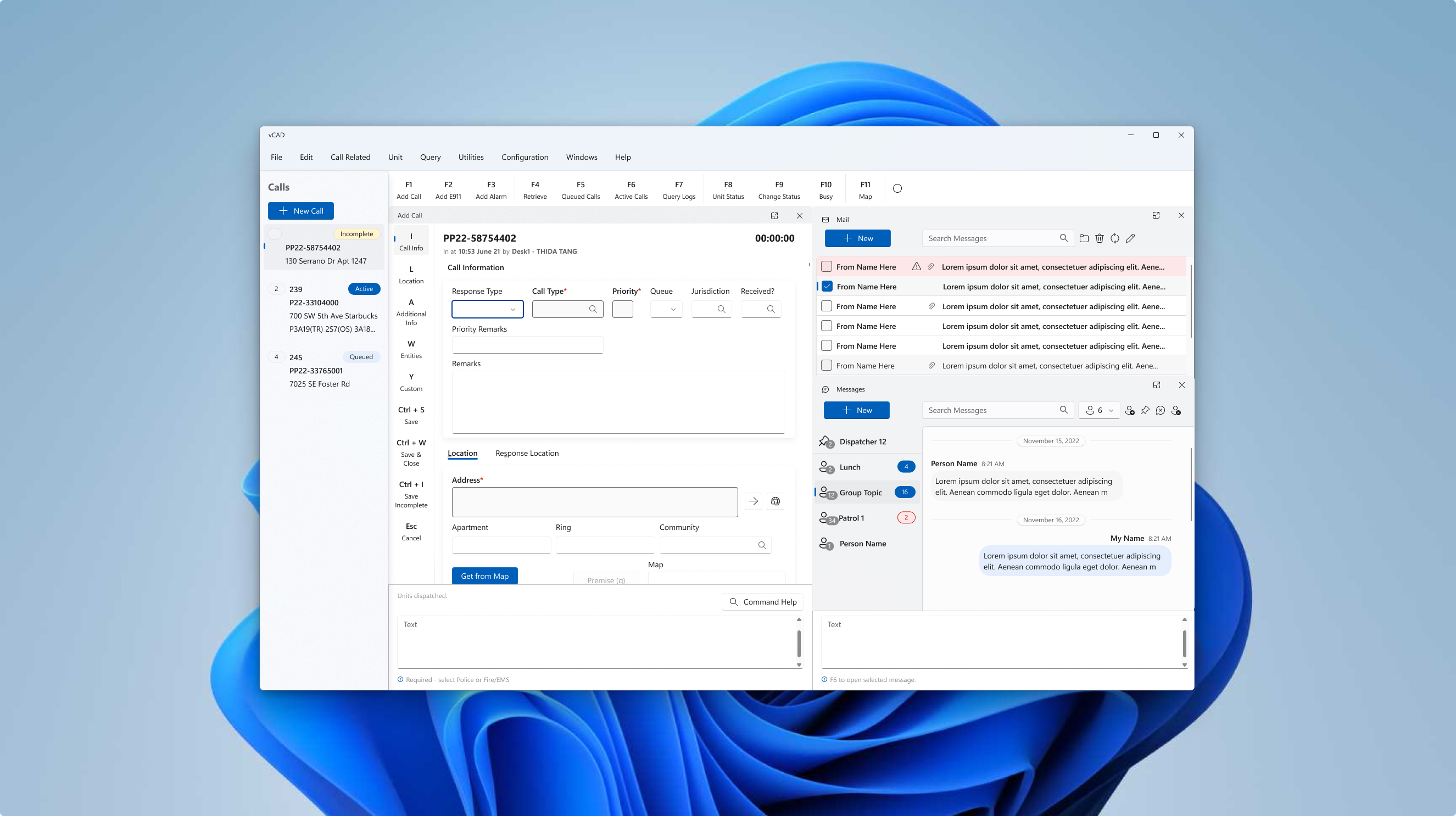
First we researched their existing products. This was difficult since Versaterms products were locally stored. Versaterm could not give us access to real data since it was sensitive information. We had many meetings where their team would walk us through their applications since they were so complex. during the research phase I conducted stakeholder interviews, requirements & constraints gathering, competitive analysis, design reviews, persona building, and journey mapping.

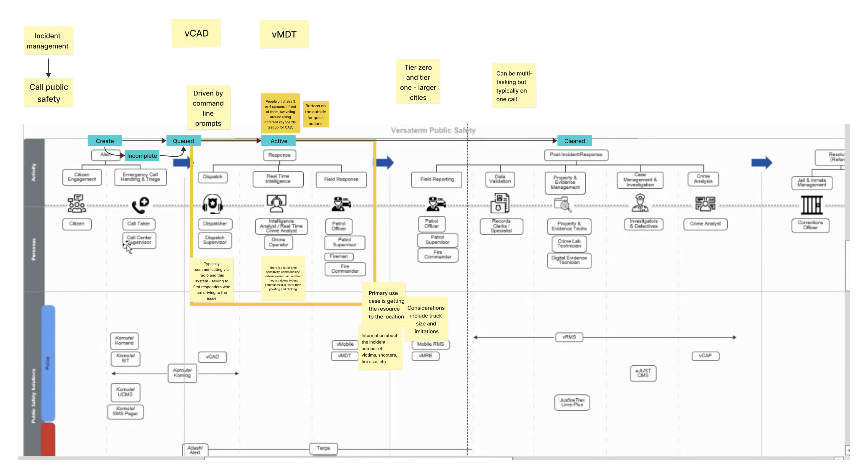
Next we dove into the audit. We looked over both MDT and vCAD products and presented our findings. Select screens and flows were agreed upon to start design after the audit.

After the audit we dove into vCAD wires. Wires were followed by high fidelity designs with select screens.

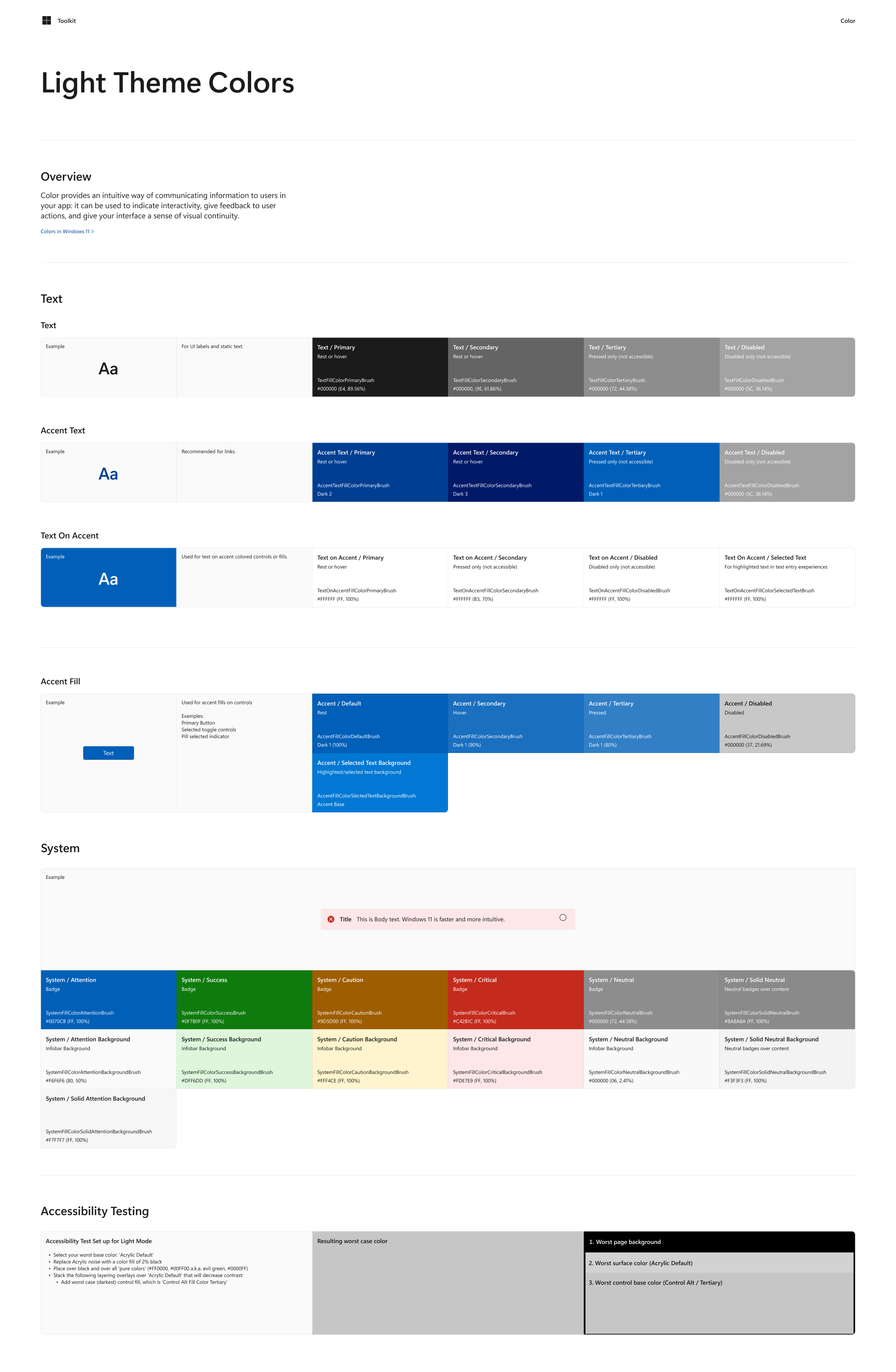
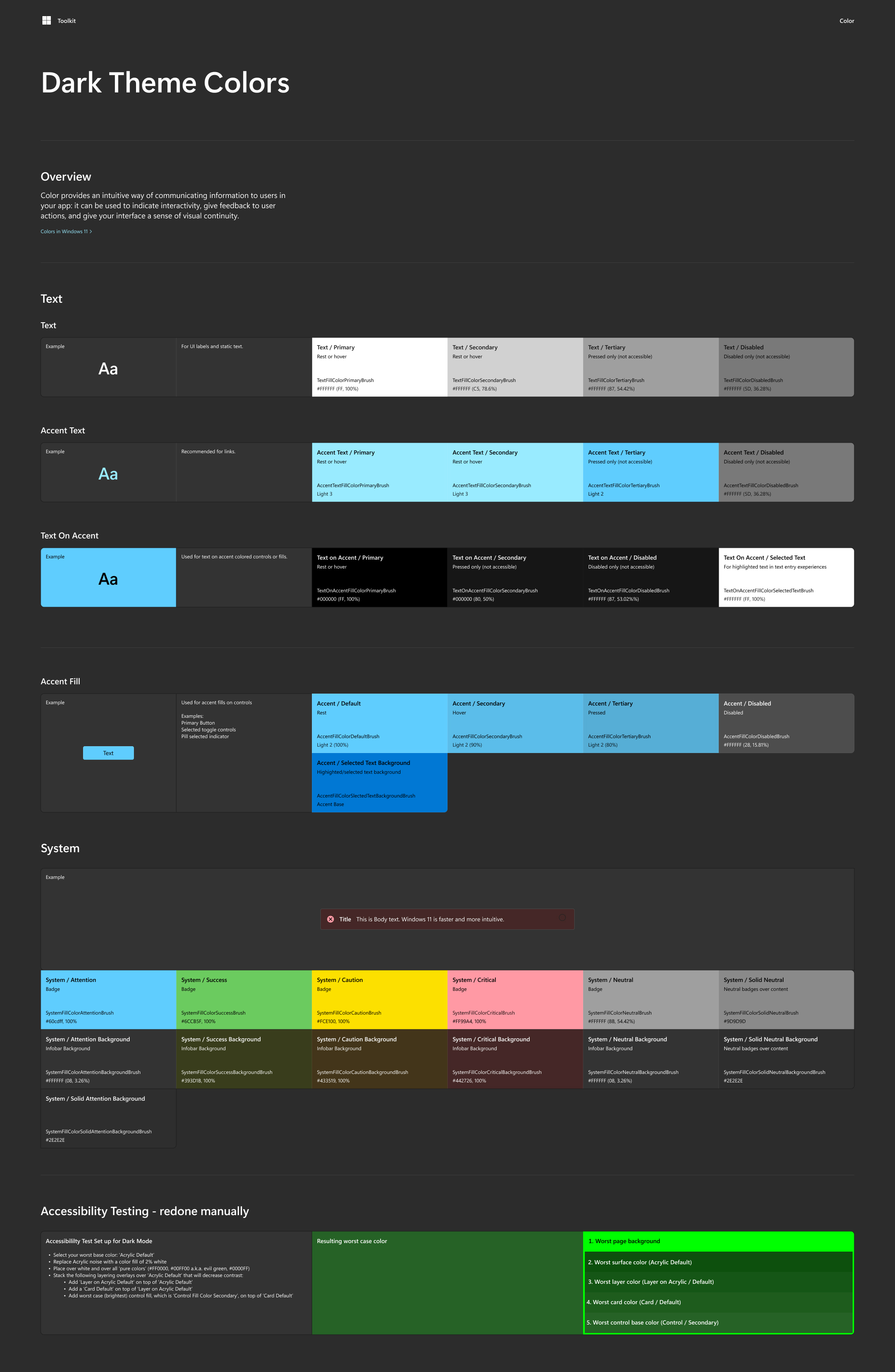
MDT was next for wire frame creation. There were a lot of back and fourth and learning more and more about how the client used their product along the way. After wires, light and dark mode were created Figma-based design system containing specs for initial UI components.

Finally we created a hand off document for their internal developers.
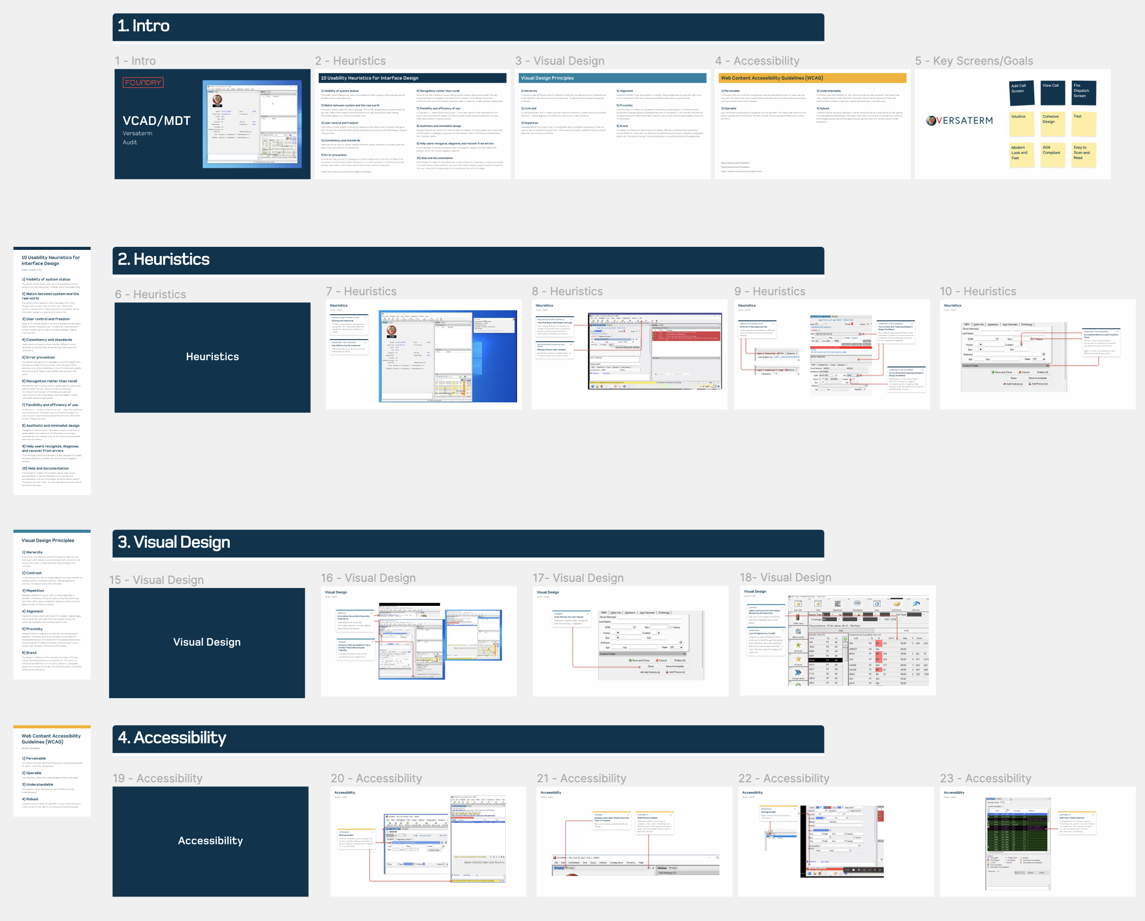
Audit

Our audit for MDT and vCAD our team reviewed the following during our audit for select screens provided by the client:

  1. Usability Heuristics for Interface Design
  2. Visual Design Principles
  3. Web Content Accessibility Guidelines (WCAG)
Versaterm Audit for vCAD and MDT Applications

Insights/ Benefits

After the audit we discovered and surfaced may problems that Versaterm was un aware of. These helped guide design decisions as well as change bad patterns that were previously built into their products. Visual modifications were also made to bring their products up to current design industry standards and stand out from the competition.

Versaterm now has guidelines to use for the rest of their products. We also provided Versaterm with general UX testing so they can test their products in the field and make edits.

Get in touch and let's talk about your project

Product Designer at your service. Let's start something awesome together. Send me a message!